Here are two cohorts from a worked example, both starting in the same calendar year. By month eight, one has retained 27% and the other 40%.
Blend them and you get something near 33%, a number that describes neither group, and which will drift up or down next quarter depending on how many customers each cohort happened to contain. You cannot act on it. You cannot even tell whether you are getting better.
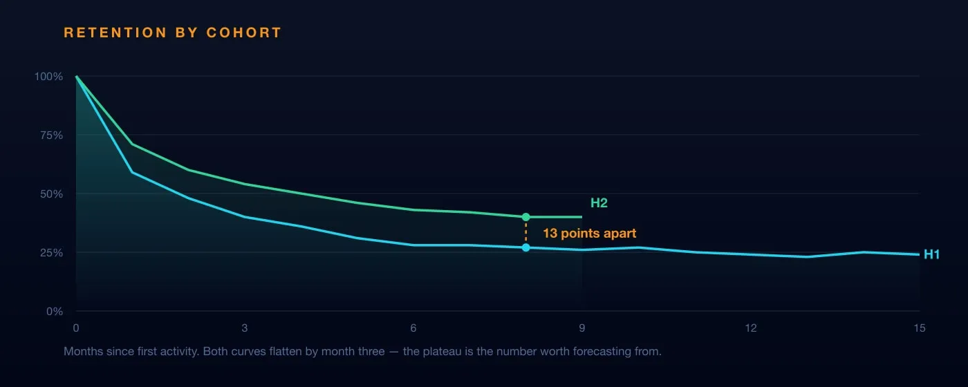
That gap is the whole argument for cohort analysis. Something changed between the first half of the year and the second, and the blended number is the one view guaranteed not to show it.
What a cohort actually is
Three things together, not one:
- A shared trait — premium users, users from a particular channel, users on a specific app version
- A shared action — signed up, made a first purchase, started a trial
- A defined window — in July, on the 25th, during the release of v4.2
“Users who installed the app in January” is a weak cohort. “iOS users in the US who installed on 17 June” is one you can compare against 15 April and learn something from.
The window is what makes it a cohort rather than a segment. A segment tells you who people are; a cohort tells you what happened to a group that started together — which is the only way to see whether the thing you changed in March worked.
Read the shape, not the last point
A retention curve does the same thing everywhere: falls steeply, then flattens. Both lines above lose most of what they are going to lose in the first three months.
The flat part is your real retention rate. The first-half cohort settles around 24%; the second-half cohort holds at 40%. That plateau is the share of people for whom the product became a habit, and it is the number worth forecasting from.
Two things worth watching in the shape:
Where it flattens. Sooner is usually better — it means people who stay decide quickly.
Whether it flattens at all. A curve that keeps declining has no loyal core yet, only a slower leak.
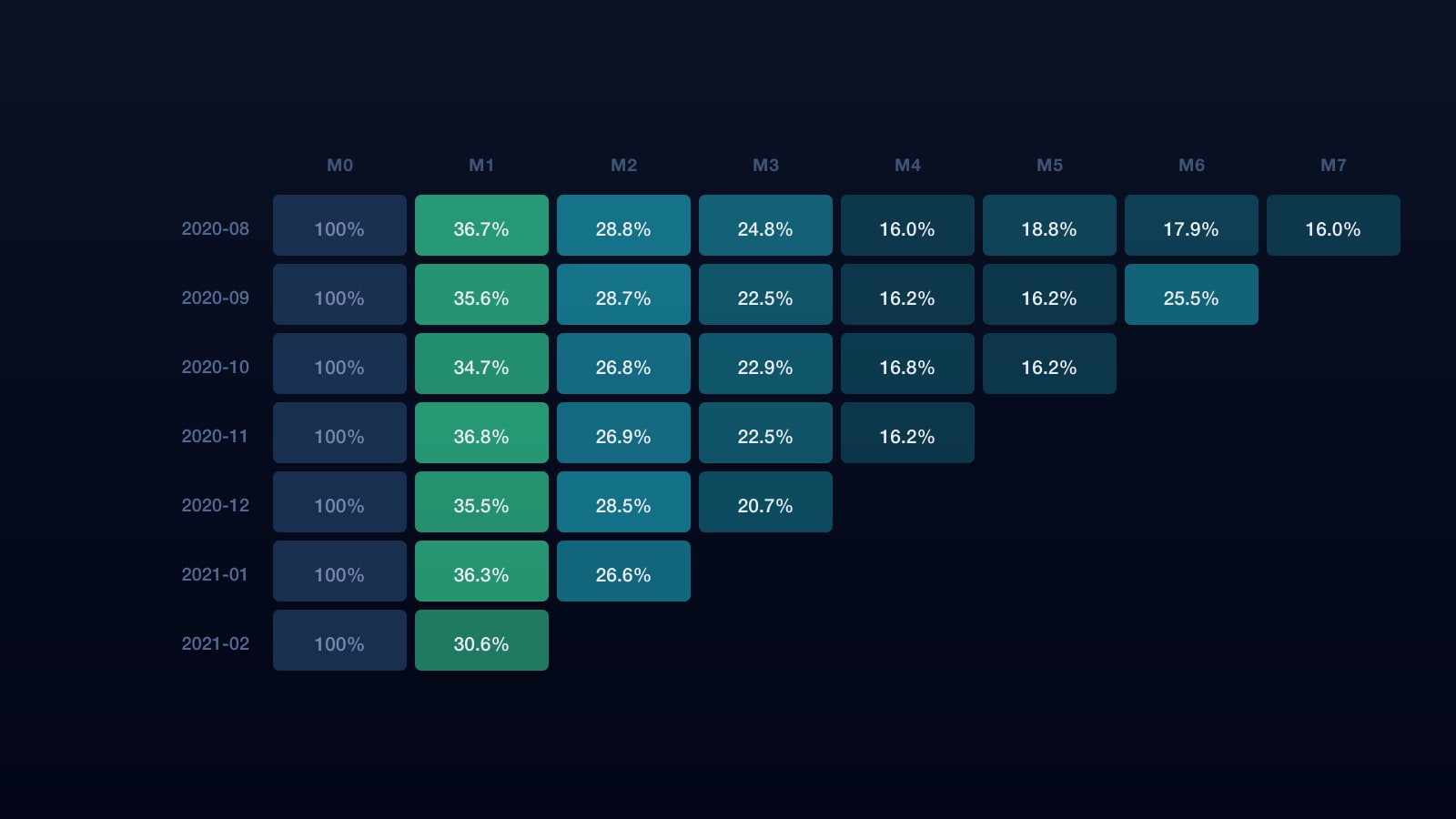
And the opposite of divergence is just as informative. In a second example table — seven consecutive monthly cohorts — month-one retention lands between 34.7% and 36.8% every single time. Cohorts stacked that tightly mean none of what shipped across those seven months changed who stayed. That is a finding, not a null result, and it is invisible in a blended number for exactly the same reason the thirteen-point gap was.
Building the table
The query is simpler than the concept. Assign every user to a cohort by their first event, then count how many are still active n periods later:
with first_seen as (
  select user_id, date_trunc(min(event_date), month) as cohort_month
  from events group by user_id
),
activity as (
  select f.cohort_month, f.user_id,
         date_diff(date_trunc(e.event_date, month), f.cohort_month, month) as month_number
  from events e join first_seen f using (user_id)
)
select cohort_month, month_number,
       count(distinct user_id) as active,
       count(distinct user_id)
         / max(count(distinct user_id)) over (partition by cohort_month) as retention
from activity
group by cohort_month, month_number
order by cohort_month, month_number
One definition decides everything this returns: what counts as active. Logged in? Completed a core action? Paid? Whichever you choose, it has to be written down once and used everywhere, or two teams will publish two retention rates and both will be right.
Gross and net retention are not two views of the same thing
This is where the number most often flatters a business.
Gross retention counts customers who stayed. It ignores upsells entirely and caps at 100%. A customer who churns and returns later is not retained — they start a new cohort in the month they came back.
Net retention counts revenue, including expansion from existing customers. It can exceed 100%, and routinely does in businesses that upsell well.
The trap is that they move independently:
| Gross | Net | What is happening | |
|---|---|---|---|
| Healthy | 90% | 115% | Keeping customers and growing them |
| Flattering | 72% | 108% | Losing customers, upselling the survivors |
| Leaky | 91% | 94% | Keeping customers, not growing them |
The middle row is the dangerous one, because net retention above 100% reads as success in every board deck. It can persist for a year while the customer count falls, and it ends the moment the remaining accounts run out of room to expand.
Report them together or neither is informative.
What to do with it
Cohort by the thing you changed. If you shipped a new onboarding in March, the cohort dimension is the version people landed on. Comparing March to February tells you nothing if half of March got the old flow.
Pair it with an A/B test when the change is large. Cohorts show what happened; a controlled test shows whether your change caused it.
Re-run it on a schedule. Cohort analysis is not a one-off study — the value is in watching a curve move after you act, which means the underlying tables need to be as reliable as the decisions you hang on them.
The takeaway
A blended retention rate is an average over groups that are usually moving in different directions. It cannot tell you whether the thing you changed worked, because it mixes the people who experienced the change with the people who did not.
Cohort by the thing you changed, read the plateau rather than the last point, and never report net retention without gross beside it.
This is the shape of analysis Datablast is built for — governed definitions so “active” means one thing, and modelled tables that let a cohort question be answered in a query rather than a project. It is the same pattern behind the retention and RFM work we do in e-commerce.
Originally published on datablast.io in July 2023, alongside a companion piece on what cohort analysis is. Merged, rewritten and expanded September 2026.
See it on your own data
20 minutes, your questions, a live walkthrough.